I’m proud of all the team has achieved in the creation of our new website. Since the start of the project we’ve treated ourselves as a client and “walked our talk” by putting business case and core values first to reach an effective outcome.
From strategy and planning, to site structure, design, content plan and build – we’ve followed the same steps we take our clients through. The outcome is a great looking, high performance website that communicates our proposition, describes our services and showcases our work successfully. Even if we do say so ourselves!
This illustrates a fairly typical “from scratch” website design and build process, so I thought that sharing the steps we followed (along with the highs and lows of our journey!) might prove a useful guide for anyone undertaking a new website project.
Strategy & planning
We started our website strategy by outlining the high-level outcomes we wanted to achieve. In summary, these were to:
Showcase Monogram’s capabilities and our work. We’re a class leading digital agency and our website should prove that.
Engage with our target audience effectively. Our users must be able to find what they’re looking for quickly and we should communicate clearly.
Generate relevant sales leads. This means reaching relevant audiences and encouraging engagements such as use of lead magnets and contact forms.
Demonstrate thought leadership. We know our stuff! Demonstrating this creates credibility and rapport with our audiences.
Be as sustainable as possible. We must use web hosting powered by renewable energy sources to help lead the way towards a greener internet.
Referring to our strategy helped us to generate a website structure that reflected the way we believe our identified user personas will navigate our website. You may have noticed that we tend to lead with our Work pages, for example. This is because we believe that once we’ve said we can do something, it’s important that we back-up our claims with examples.
Our strategy also helped us to originate and plan important pieces of functionality. Here are a few, by way of example:
A Content Management System (CMS) to enable us to easily add and update pages, case studies and articles.
Sustainable web hosting with excellent performance.
Automatic sizing and optimising images on the site.
Forms that integrate with our CRM solution.
A tool to help prospective clients measure the performance of their existing websites.
Armed with our strategy, a list of functional requirements and a site structure, we set to work using our favourite project management tools to help us create a realistic, achievable, time based plan with an accompanying budget.
I can’t overstate how important the planning process is. When we do this with clients, there is sometimes a tendency to want to “just get started” and it’s often a time to manage expectations. Admittedly it’s not the most exciting phase and tangible outputs at this stage tend to be staid (think Gantt charts and written documents). But without them, a project is unlikely to meet its goals and it’s difficult to create budgets, monitor progress and keep a team on time and on track. With all that said, I did find myself dreaming about how the new site might look whilst we created our all important plan!
Content
Using our structure, we began work on a content plan. We knew we’d want content that described us and our services as well as showcasing projects and displaying our articles.
We began by referring to our brand guidelines and considering tone of voice, as well as identifying keywords that our target audience might use to find us. Writing first drafts of our homepage along with a sample of services, case studies and articles gave us enough content to design with content in mind. This is always useful, as it gives us an idea of content length and media use ahead of the creation of the templates that will house them.
The production of website content can be a tricky business and the time it takes to write content, source media and review it all can be surprising. We therefore started this process as soon as possible, but still had a flurry of edits and changes toward the end of the process to refine it all.
Design
With a full plan, structure and understanding of how the website needed to perform and function, it was time to roll up our sleeves and start making.
Typically we’d start this with a wireframing phase, in which we model how specific pages and page templates will be laid out before considering aesthetics. This helps clients to understand, consider and feedback on function and messaging priorities ahead of aesthetics such as colours, imagery and font choices. These models are clickable, which also helps illustrate the user journey. Considering these factors ahead of build is very important, as it’s much easier to change and remodel things at this stage as opposed to needing to reengineer potentially thousands of lines of code during the build.
On this (rare) occasion though, we felt that we were so close to the project requirements, the user journey and the brand that we could skip this stage and start with the fully fleshed design.
Using Sketch, our favourite web design tool, we started by creating a “theme” for the site. This took the brand guidelines - colours, fonts, typographic hierarchies, gradients, images, icons and the rest - and used them to create a set of rules and assets that we used to create the website and house its content. Essentially a system that dictates the appearance of buttons, links, navigation and so on.
We also designed grids that give our layouts rhythm and structure at varying content widths - testing that these worked responsively across typical desktop, tablet and mobile sizes.
Using the brand guidelines, direction from our planning, design system and some content we’d drafted, we started designing. For successful outcomes across device types and sizes, we like to design simultaneously for desktop and mobile and this website design was no exception.
Things didn’t all go smoothly and according to plan. At times it was difficult to disconnect from how close we were to the project and this led to some designers block and three initial versions and directions were put into the virtual bin! In our fourth version though, we really started to nail it and after some constructive team feedback we were answering the brief by designing a site that:
Communicates in a clear and concise way.
Shows what we do with clarity and backs this up with case studies and client testimonials.
Allows potential and existing clients to move through stages of awareness, engagement and contact.
Incorporates content blocks and templates that allow easy content management.
Works well across modern desktop, tablet and mobile devices.
Development
With a full set of desktop and mobile designs in hand, we set to work building the functioning site. This meant writing code using a mixture of front and backend technologies that help us to create both the content management and in browser experiences and processes. We also planned to use a modern, fast and robust hosting method that meant we needed a content management system (CMS) that would enable us to publish content in a specific way.
We initially selected WordPress for this and wrote some code that would perform this task for us whenever content was added or updated. We soon hit some limitations and developmental slowdowns however and began to question our decision. After some discussion, we decided to switch to Statamic and were immensely glad we did. This more modern approach coupled with the power of Laravel and some of our own internal process design makes the site very fast, easy to manage and right on brand. Even though the decision to switch to Statamic changed our timeline, it was right for the project and we learnt a lot in doing this. We’ve ended up with a finessed codebase that will be much easier to manage and is easily extended as and when we need.
Once the initial site build was complete, we began testing. For this we use suites of both automated and manual tools that enable us to make sure our code follows industry standard practices and works across a range of target devices and browsers.
Green web hosting
Once our new site had passed our internal tests, it was on to making it visible to the world. During the development process we’d established platforms and processes for this that take both performance and sustainability into account. Essentially we wanted the best of both worlds here – something very fast, but also something sustainable and I’m pleased to say we achieved both.
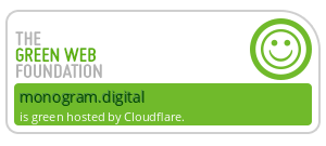
Our approach is to host our content management system privately on a very low power web server in a data centre that uses only sustainable energy. When changes are made via the CMS, they automatically deploy to a content delivery network (CDN) that again takes energy consumption and our climate into account whilst offering up some of the best performance figures we’ve ever seen. Initial server response times are typically 100ms – so the time between you linking to our site to our servers sending back some kind of response is 1/10th of a second! Turns out being fast can also be sustainable and we’ve earned a Green Web Foundation badge as a result.
We use Cloudflare’s CDN and you can read more about The Climate and Cloudflare and check Cloudflare’s Emissions Inventory for more information on their sustainability credentials.
Go-live
As soon as everything was ready we decided to perform a “soft-launch” of the site – making it live for a few weeks with no launch tactics. This gave us the opportunity to attract a bit of traffic and start to understand how the site would perform in the real world, as well as to redirect traffic from our old website to our new one as we have a shiny new domain now too!
The results
So far the site appears to be performing well. Anecdotally we’ve had some great feedback from those who have seen it, but we’re also seeing very good performance figures and engagement rates via the analytics tools we use. The site is beginning to rank well in search engines for a number of relevant keywords too, which is very encouraging at this early stage.
We’re not done
As with all websites, the initial launch is really the start of a new chapter. We’re now into a phase of testing and measurement in which we will continuously monitor, check and improve all aspects of the site based on real world data and responses to our content. This is immensely important – websites are measurable, living breathing works that should evolve, grow and improve over time. So, please keep checking back to see more!
If you’d like to discuss any aspect of this article or indeed our work and services, please get in touch.