- Work
- A new website for Monogram
A new website for Monogram
We made ourselves the client when we undertook a Monogram rebrand. Part of the process required us to design and build a new website for ourselves.
While this was an internal project, we felt it was important to go through the steps we would take our clients through. We followed our website design and build process that covers strategy and planning, design, content plan, build and hosting.
Strategy & Planning
Creating a strategy helped us to plan out what our important functional requirements were, along with a site structure. In summary, these were:
a CMS, to enable straightforward content updates by non technical team members
fast, robust, sustainable hosting
automatic sizing and optimisation of images
form integration with our CRM
Once we had this we were able to start planning in earnest. This stage is crucial and although there is a tendency to want to skip over it, we knew we needed to give it the required attention. We used a project management tool to create a realistic, achievable, time based plan with an accompanying budget.
Design
With a full plan, structure and understanding of how the website needed to perform and function, it was time to roll up our sleeves and start making.
Using Figma we created a “theme” for the site. We used our brand guidelines to create a set of rules, assets and components that we used to compose the website and house its content. These rules create a system that dictates the appearance of buttons, links, navigation and so on.
We designed grids that give our layouts rhythm and structure at varying content widths and tested that these worked responsively across typical desktop, tablet and mobile sizes. Once we reached a design that we were happy with we checked we had answered the brief by designing a site that:
Communicates in a clear and concise way.
Shows what we do with clarity and backs this up with case studies and client testimonials.
Allows potential and existing clients to move through stages of awareness, engagement and contact.
Incorporates content blocks and templates that allow easy content management.
Works well across modern desktop, tablet and mobile devices.
Content is key
We used our structure to work on a content plan. The requirement here was to describe Monogram and our services, showcase projects and display articles. We used our brand guidelines and tone of voice to inform our content and identified keywords that our target audience might use to find us.
By drafting our homepage, services, case studies and articles we could get an idea of content length and media use ahead of creating the templates that will house them. This was done with the knowledge that there would be a requirement for edits and changes as we got nearer to the end of the project.
Development
We used the full set of desktop and mobile designs to build the functioning site. This meant writing code using front and backend technologies to help us to create both the content management and in browser experiences and processes. We also planned to use a modern, fast and robust hosting method that meant we needed a content management system (CMS) that would enable us to publish content in a specific way.
Once the initial site build was complete, we began testing. For this, we use suites of both automated and manual tools that enable us to make sure our code follows industry standard practices and works across a range of target devices and browsers.
Green Web Hosting
Once our new site had passed our internal tests, it was on to making it visible to the world. During the development process we’d established hosting platforms and processes that take both performance and sustainability into account.
Our approach is to host our content management system privately on a very low power web server in a data centre that uses only sustainable energy. When changes are made via the CMS, they automatically deploy to a content delivery network (CDN) that again takes energy consumption and climate into account, whilst offering up some of the best performance figures we’ve ever seen. Initial server response times are typically 100ms – so the time between you linking to our site to our servers sending back some kind of response is 1/10th of a second!
Results
We successfully delivered a best in class website that reflects our vision, values and personality.
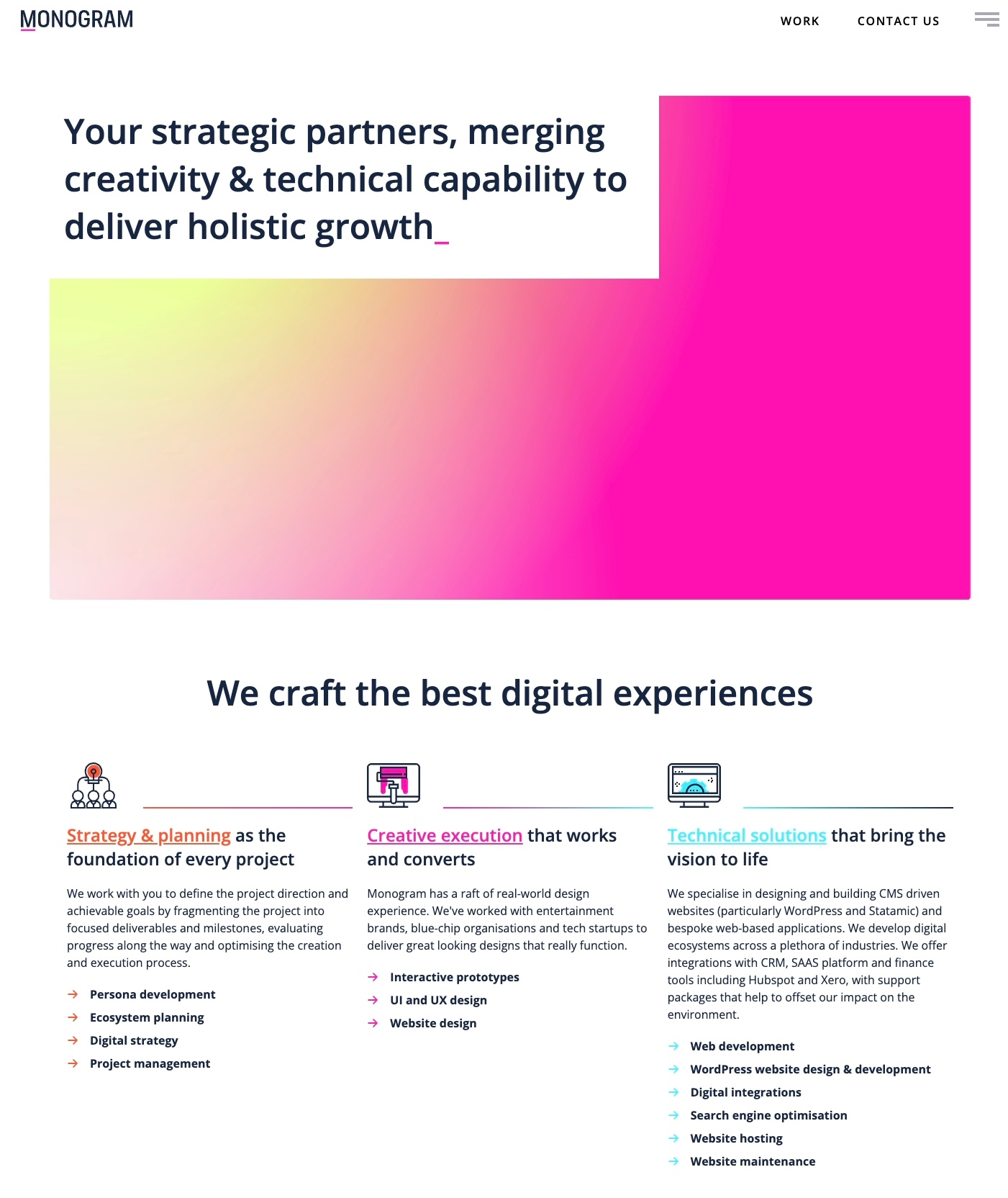
We used Statamic CMS and were very glad we did. This modern approach coupled with the power of Laravel and some of our own internal process design makes the site very fast, easy to manage and right on brand.
We have the ability to showcase our capabilities with an easy to use CMS. We can easily upload articles to demonstrate thought leadership, share our learnings and add case studies. And we’ve ended up with a finessed codebase that is easy to manage and is easily extended as required.
Using green energy to host our website has been great for our sustainability requirements. According to a website carbon calculator we have achieved a carbon rating of A and our website is cleaner than 89% of all web pages globally.
As a result of the way that we host, we have achieved an impressive 86% decrease in our time to first bite score. Fast can also be sustainable and we’ve earned a Green Web Foundation badge too.
 Our site meets WCAG 2.1 AA standards, making the content more accessible to a wider range of people with disabilities
Websites don’t stand still and having the capability to easily make changes and add features is essential. Whilst we haven’t done anything radical, we’ve updated our homepage to feature our solutions, created a glossary and are working on our FAQ section. Watch this space!
Do you need a new website as part of your rebranding process? Get in touch to see how we can help meet your needs. Contact us here
Releated Services
Ready to get cracking?
Start your project