Content is key
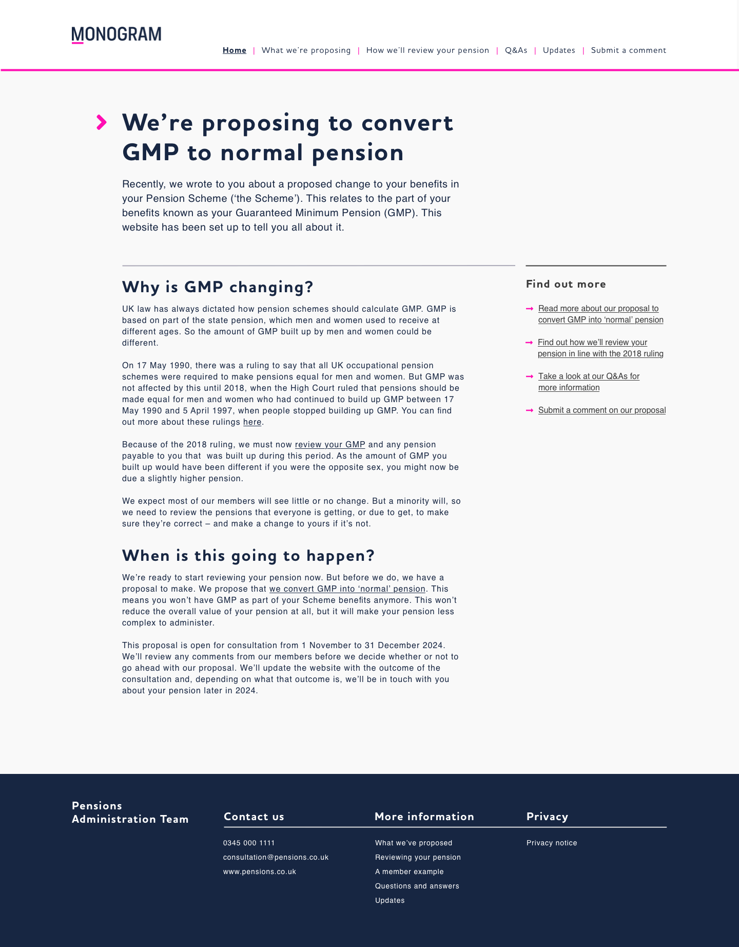
We made sure that we designed and built the website in a way that was easily navigable – paying particular attention to the audience of older adults who may have limited technical experience. We also ensured a design and build that accommodates users with visual impairments by implementing a high contrast design that uses clear, legible typography. We worked to WCAG 2.1 AA standards (which aim to make content more accessible to a wider range of people with disabilities) as a minimum here.
Information hierarchies
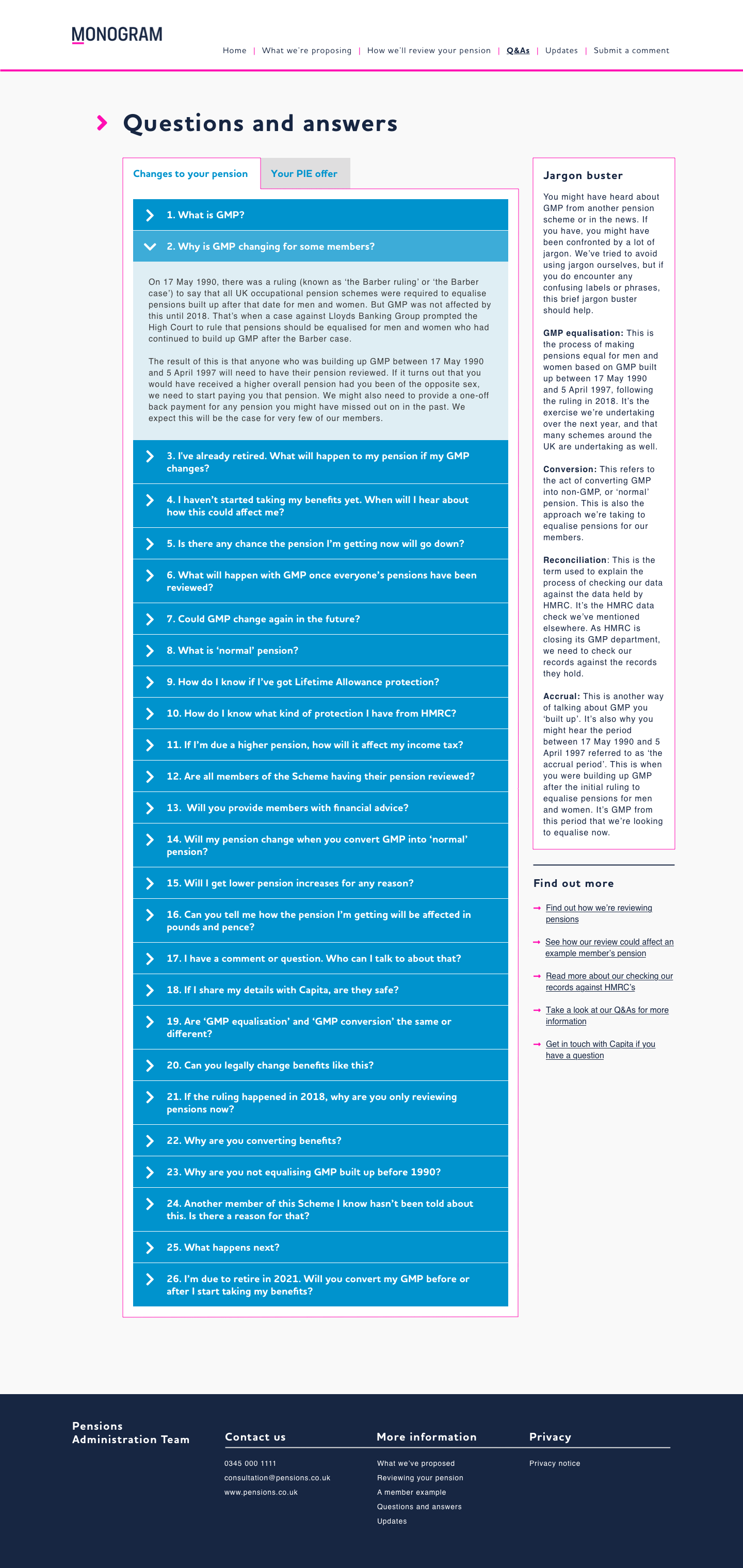
Not only did the content need to be clear, it also needed to be easily comprehended. Some pieces were long but important, so we used typographic hierarchies and simple progressive disclosure techniques (e.g. accordions) to break this complex content down into easily digestible pieces. Our designs also accommodated rich media that included images, diagrams, graphs and videos.
We also kept navigational paths simple – users always know where they are on the site and simple narratives help guide them through the content available.
Easily updatable content
The plan for this communication project was that additional information and content would be added over time. This included regular updates to the FAQ section, which was key as it helped to address common queries and concerns quickly, alleviating administrative load on the comms team. To enable the team to make changes whenever they needed to, we built the site using Statamic – a robust, modern and easy to use content management system (CMS). Since the site featured a number of downloadable documents, we made sure there was an easy way to manage these from the CMS too.
Robust security measures
Since this is a two-way communication piece we also created a contact form on the site, so that members could easily ask questions. Given the potential sensitivity of these enquiries, we employed robust security measures to protect user data and ensure privacy. We also delivered a GDPR compliant tracking solution that delivered reports on user journeys, engagement, document downloads and number of enquiries generated, giving the team a sense of ROI.
Results
We successfully delivered an on-brand information portal that clearly conveys complex messaging to the target audience – and in a short timescale too. It has been well used, well received and our client’s comms team have found it a cinch to update too. Our robust hosting solution has kept the site available 100% of the time since go-live and our proactive monitoring, support and maintenance packages keep it that way.
If you’d like to find out more about how we create website based Information Portals, please contact us.

